Loading…
Loading…
GT Zirkon freely mixes historical and contemporary ideas in this new sans serif design. Created by Tobias Rechsteiner over a nine year period, this typeface may sparkle like a gem stone — but we think of it more like a heavy-duty tool with exquisite utility. It unites aspects typically associated with typefaces optimized for body copy sizes with more exuberant details usually found in display type.
The design started with an idea, not with a drawing. Like a sculptor, Tobias had to chisel away most of his ideas’ mantle to create what, over the years, became GT Zirkon. He wanted to create something practical with great performance at small sizes.
And so what took shape eschews usual historical categorizations. Instead, the design takes useful elements from a variety of sources and combines them to a new whole.
Despite the influence of historical details, the goal was to create a contemporary typeface. GT Zirkon uses these details of early 20th century designs to create a typeface that is contemporary in its form and execution.
With a clear concept in mind, Tobias dedicated a lot of time to carefully placing the weight in the right spots of each character to ensure a clean look at text sizes. While applying the typeface in his own design practice, he constantly adjusted details to suit his own needs. Its high contrast required visually balancing the characters again and again — leading to a steady development process over the past nine years.
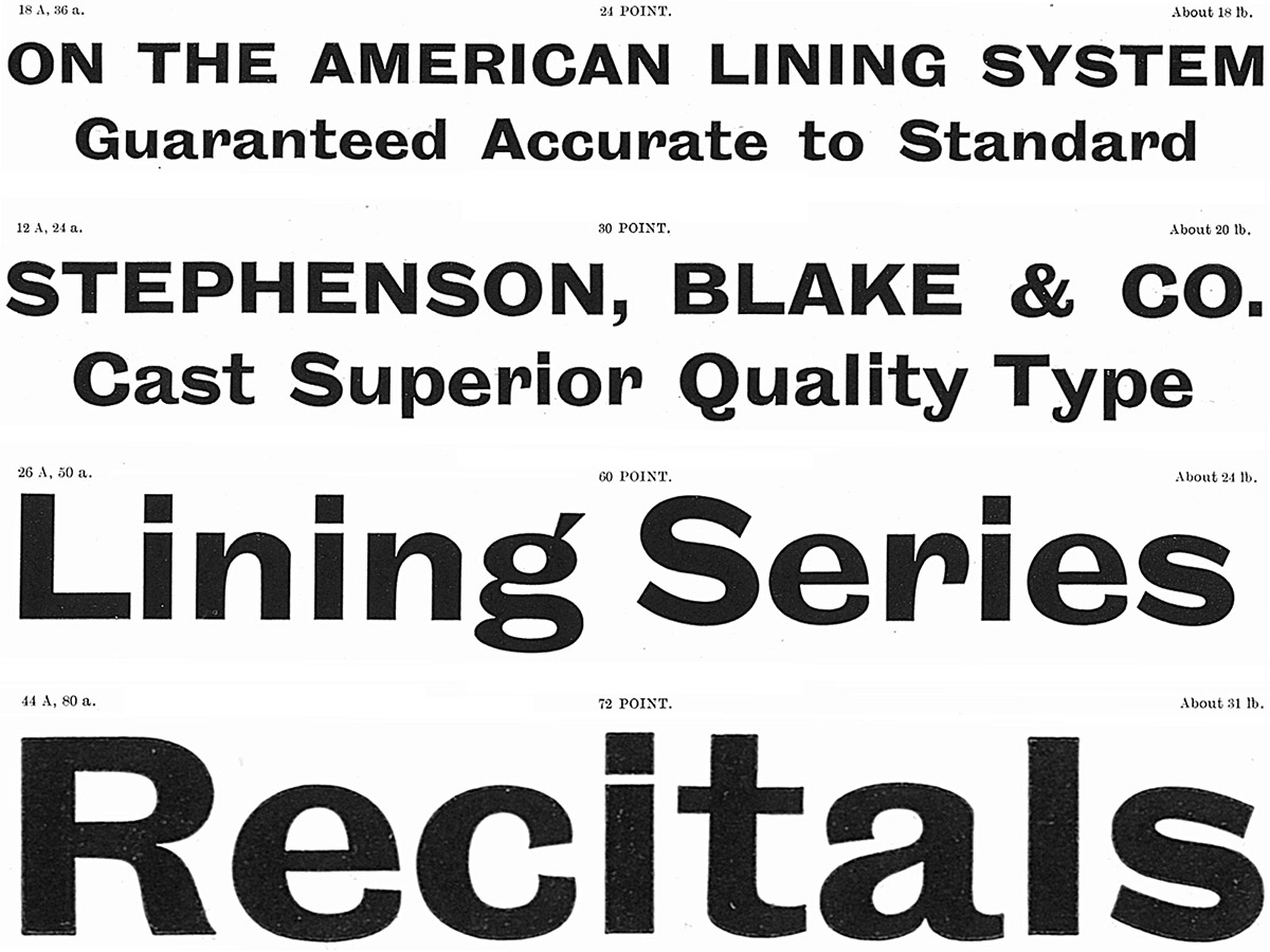
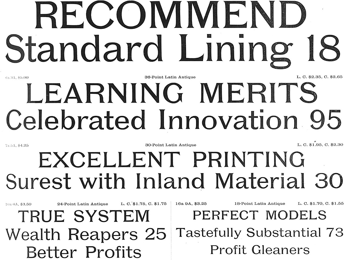
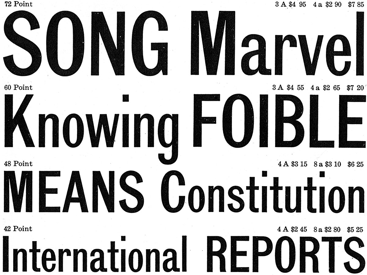
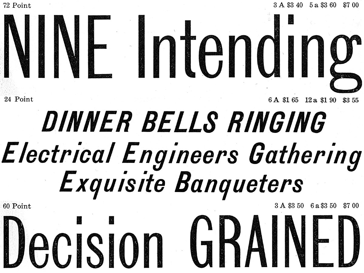
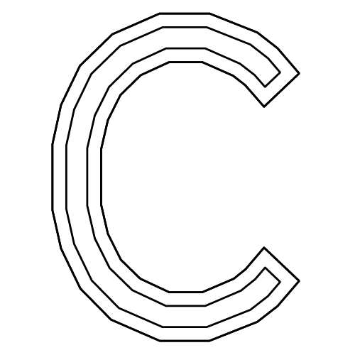
The quirkiness of 19th and early 20th century gothic designs strongly influenced GT Zirkon. Many aspects of the typeface — like its narrow character width, inward curls on letters like C, G, and S, and its higher than usual contrast — can be found across the examples shown below.
Inland Gothic No. 6 – 1898 – Inland Type Foundry
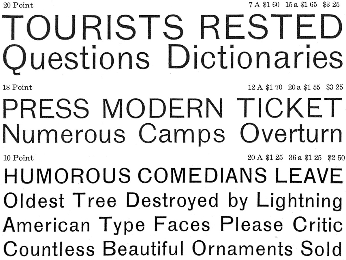
Grotesque #8 – 1880 – Stephenson Blake
Grotesque No. 10 – 1918 – Miller & Richard
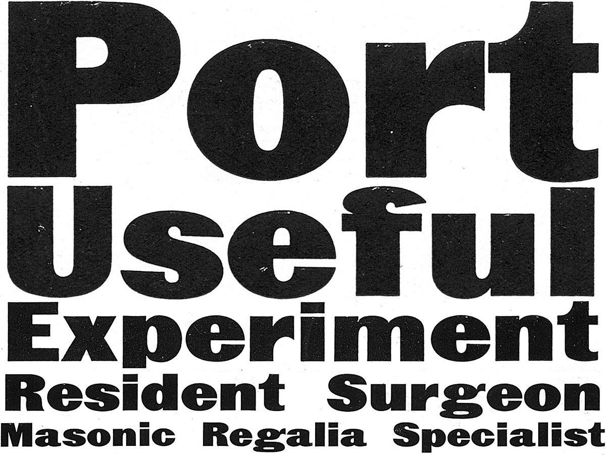
Poster Latin Antique – 1897 – Inland Type Foundry
Lining Gothic Condensed – 1906 – American Type Founders
Lining Gothic Condensed Italic – 1906 – American Type Founders
The typeface family with its eight weights can be categorized into three sections.
Unlike more modern sans serif designs, the light weights don’t aim for neutrality but instead embrace the stroke contrast from the heavier weight, leading to an elegant look.
The two middle weights – Book and Regular – are both equally suited for body copy usage, with their design showing more restraint and a lower stroke contrast.
Towards the heavy end of the family, the styles become more extravagant again, with the Black weight performing best at large sizes.
GT Zirkon’s design expresses itself in different ways across different sizes and weights. Its ink traps aid rendering at text sizes and become an expressive element in their own right when the typeface is used larger. The typeface’s stroke contrast between vertical and horizontal strokes is at its lowest in the Book and Regular weights which helps with readability in body copy.
Overall, GT Zirkon sports an unusually high contrast between thin and thick strokes for a gothic typeface. Supporting the sparkling effect introduced by the tapered curves and ink traps, this feature leads to a generous and light texture.
The typeface uses ink traps in both expected and unexpected places – for horizontal curves in the R, in the K and 8, to make the ear of the g stand out, and so on. As such, ink traps are used both to aid performance in small sizes and as a stylistic device in general. And it turns out that ink traps, originally used to improve performance at small print sizes, work just as well on screens with their pixel grid.
Nodding to its historical roots in the 19th century, GT Zirkon sports angled terminal strokes that curve inward ever so slightly. These idiosyncratic elements are a simple but effective tool that lend the typeface character while being practically invisible at small sizes.
Across the typeface, traditionally wide letters are more narrow and narrow characters are wider, which leads to relatively uniform character widths and a very regular rhythm. This differs markedly from more common sans serif designs that allow for much more variety in their horizontal proportions. The animation shows the difference between GT Zirkon and a more traditional design.
The roman styles are complemented by the more free-flowing approach of the italic.
However, designing italic counterparts for sans serifs can be tricky. With a design that comfortably sits between the mechanical slanting of an oblique and the calligraphic nature of a true italic, GT Zirkon sports a 13° italic angle — a feature rarely seen in sans serifs.
GT Cinetype
GT Eesti
GT Haptik

GT Super
GT America
GT Walsheim